

Reading Time: 6 minutes read
You know how to zoom, filter, and set scene modes. You understand depth of field. And you live by the rule of thirds. But you’re still not getting the powerful, eye-catching photos you want. That’s where contrasting color photography comes in handy. It’s a fairly simple trick everyone should have in their photography arsenal. If you’re not familiar with this technique or need a refresher, here’s the what, why, and how of contrasting color photography.
What is Contrasting Color Photography?
Contrasting color photography is a technique pitting two unlike colors against each other. Pair a dark color with a super light tone. Or cooler colors versus warmer colors. The difference between the colors is extreme.
Generally, there are more than two colors in a photo. The goal of contrasting color photography is to accentuate the contrast. When trying to create that striking contrast, two is the magic number.
Why Should You Use Contrasting Color Photography?
Not only is it fun to do, but contrasting color photography also adds a distinct look to your photos. Below are just a few reasons to give it a try:
Visual appeal – Have you ever wondered why Louisiana State University is represented by purple and gold? What about how red and green are the epitome of Christmas? It’s because there’s a psychology to color. When the brain sees certain hues together, it registers them as either in balance or at odds. Knowing which colors pair well together lets you create maximum visual appeal.
Complete control – Believe it or not, the human eye wants to be directed. It wants to be told where to look. You can do that with photography. While composition plays a role, contrasting colors take it a step further by creating dimension. Use this technique to control what the viewer sees and the order in which they see it. Keep reading for more on this.
Foolproof photos – It’s not rocket science. Anyone can use contrasting colors to enhance their photography. As long as you’ve achieved a basic level of photography skills, adding this technique to your arsenal is a breeze. The best part is, everyone loves color. You’re leveraging a universal element, which guarantees a well-received gallery of eye-catching photos.
How Can You Create Contrasting Color Photography?
There are a number of ways to execute this technique. Read through these contrasting color photography tips and find the one that suits your style. You might love them all.
1. Use complementary color schemes.
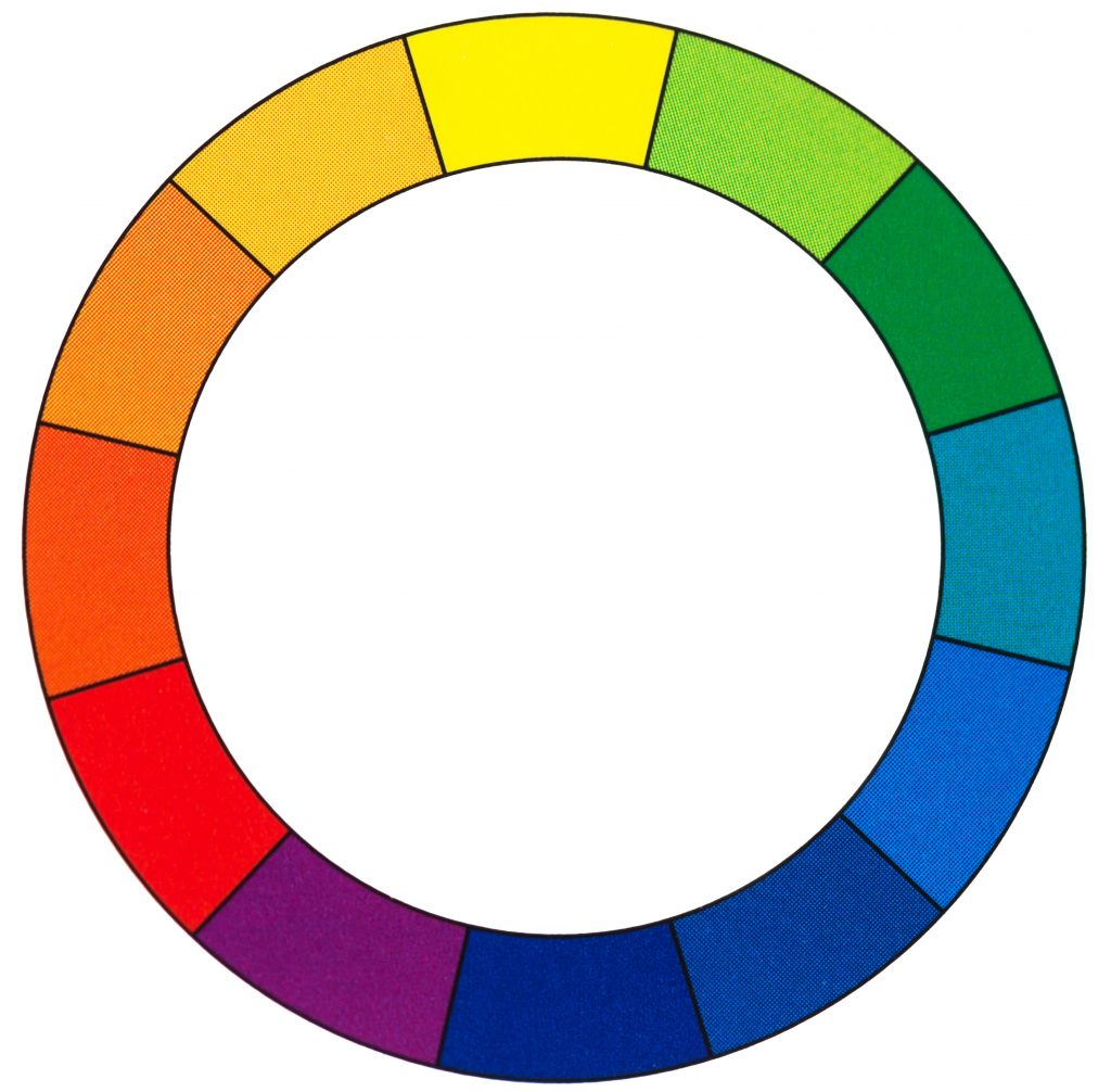
Remember the color wheel from elementary school art class? That sliced up rainbow pie-chart showing exactly which colors make the perfect match. This goes back to the psychology of color. Colors on the opposite ends of the wheel contrast one another in such a way that it’s visually striking. Your eyes are drawn to the bold combination of red and green, yellow and purple, or orange and blue. These are classic pairings easily found in nature. Or, create your own complementary color scheme with props, makeup, and clothing.
2. Understand dominant vs. receding colors.
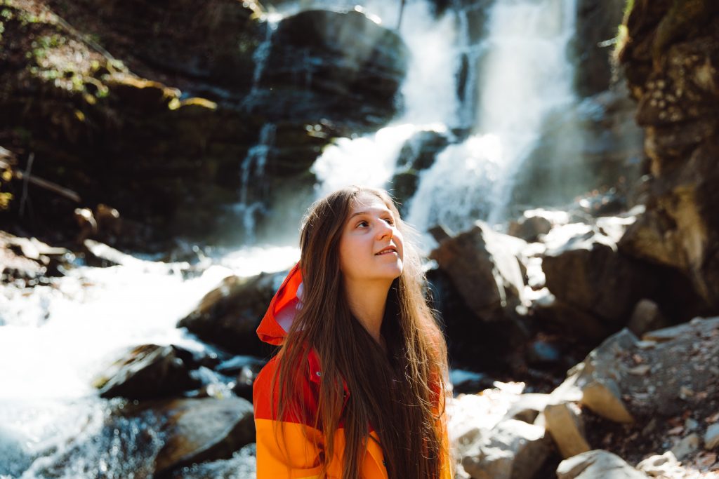
Cutting the color wheel in half creates two main categories of color: cool and warm. ‘Cool’ refers to blues, greens, and purples. Warm tones include shades of red, orange, and yellow. The warm colors tend to be more dominant. They’re what your eyes notice first. That doesn’t mean the cool colors are invisible. But they do tend to recede. Knowing how dominant and receding colors interact empowers you to create more dimension in your photography. Use dominant colors to bring a subject closer, while cool-colored objects fade into the background.

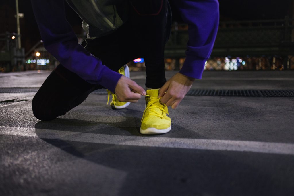
3. Emphasize bright lights and dark shadows.
In black-and-white photography, there’s a natural contrast between light and shadows. But you can emphasize this difference in color photography, as well. Note that using shadows in photography requires extra time and effort. For it to work well, you need to photograph in low lighting. Adding a flash or unnatural source of light will overrule those dramatic shadows.
4. Look for a pop of color.
A pop of color is exactly as it sounds. It doesn’t have to be a vibrant hue. Any saturated subject that stands out from its surroundings will create contrast in your photo. Make sure that pop of color is your focal point or the effect will fall flat. Zoom in if there are too many other colors within the frame.

5. Think abstract.
Contrasting color photography doesn’t have to be clear and obvious. You don’t need full subjects in the frame. Zoom in on a few toy blocks or let a bright green garden hose fill the entire shot. The idea is to combine bold color with an abstract composition. Be sure you have quality lighting to capture the truest color possible.
6. Simplify the shot.
Too much activity in the scene distracts the eye. It also tends to add more color. When trying to make a visual impact, fewer colors are most effective. When framing your photo, remove unnecessary subjects. Change the backdrop, if needed. Do whatever is necessary to keep the focus on color.
Where Can You Use These Eye-Catching Photos?
Once you have a sizable collection, put your best-contrasting color photography in a printed book. It’s a great way to showcase your skills if you’re a budding professional. Or, turn your work into photo gifts for the whole family. Download the Motif Photo app and let it do all the heavy lifting. Its intuitive technology hand picks the best of your best. It filters out dull or low-quality images. Then it autoflows them into a professionally designed layout. After adding a few personal touches, you’ll have a proud display of your contrasting color photography.


